KELVIN KOTTKE
Work experience and full portfolio available upon request ︎︎︎ kottke.design@gmail.com
︎ LINKEDIN ︎ INSTAGRAM ︎TUMBLR ︎ DRIBBBLE


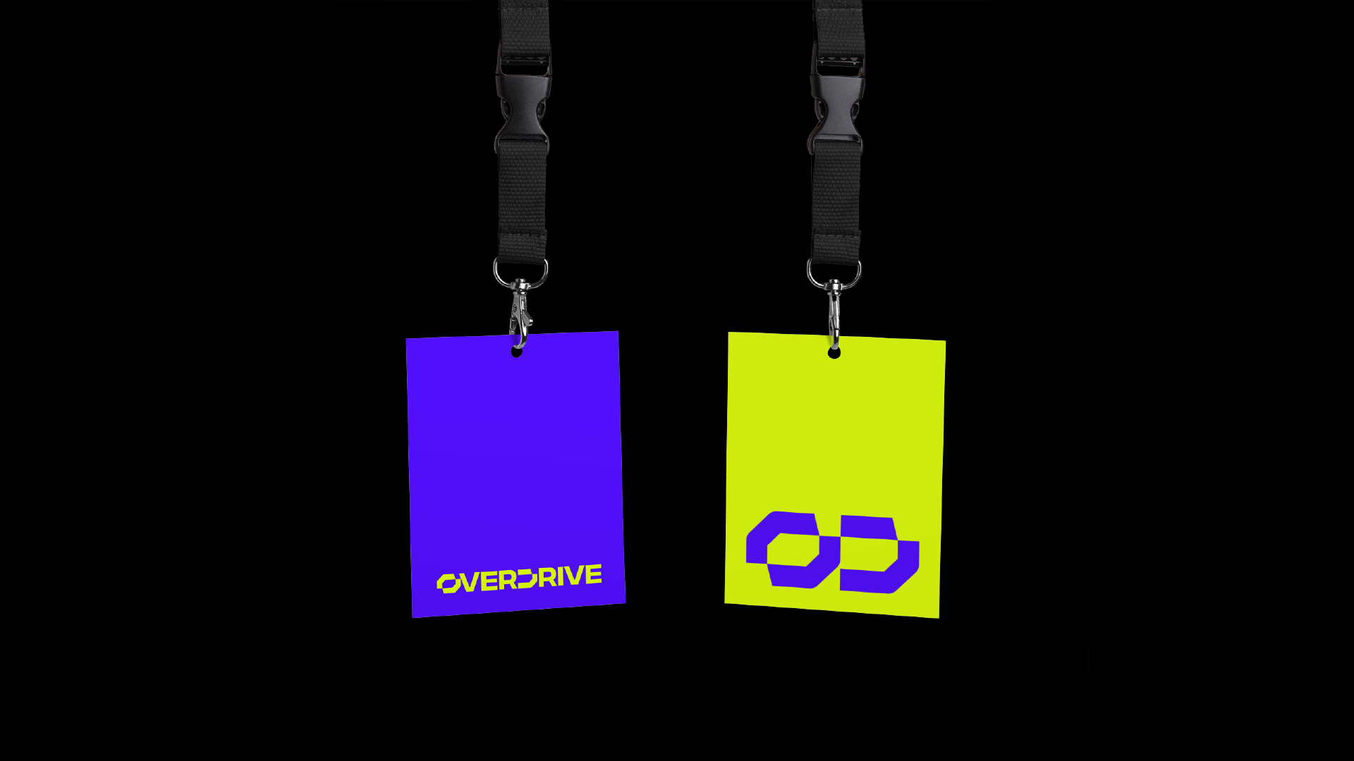


OVERDRIVE
A flexible and modular brand identity for a crypto platform that gamefies the trading of NFTs. Developed together with Decoded Advertising.
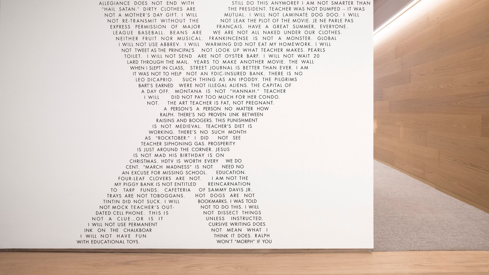
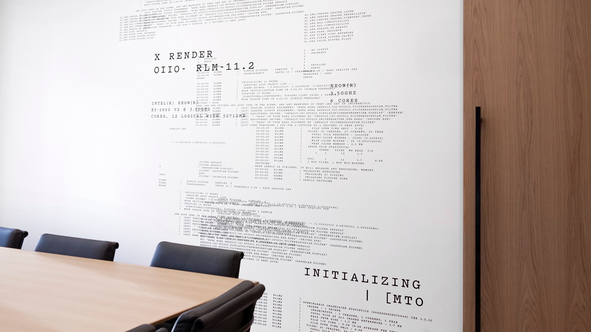
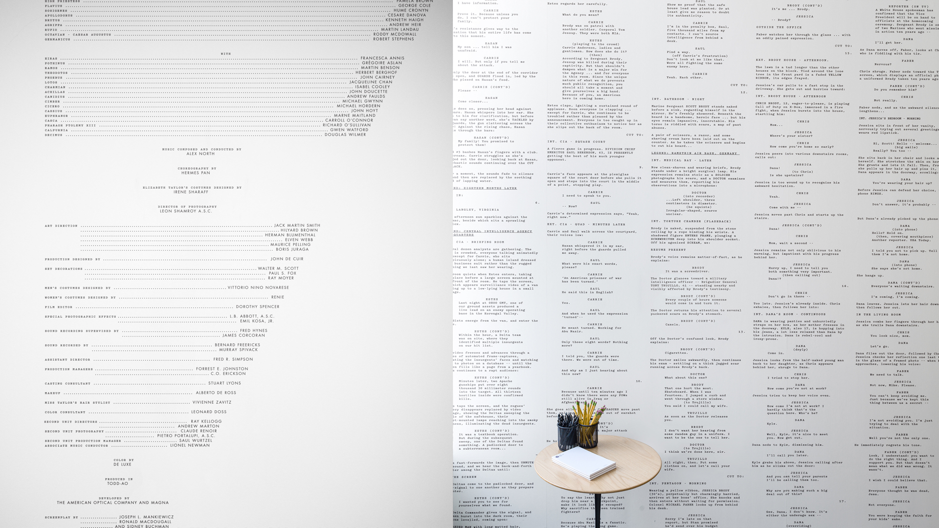
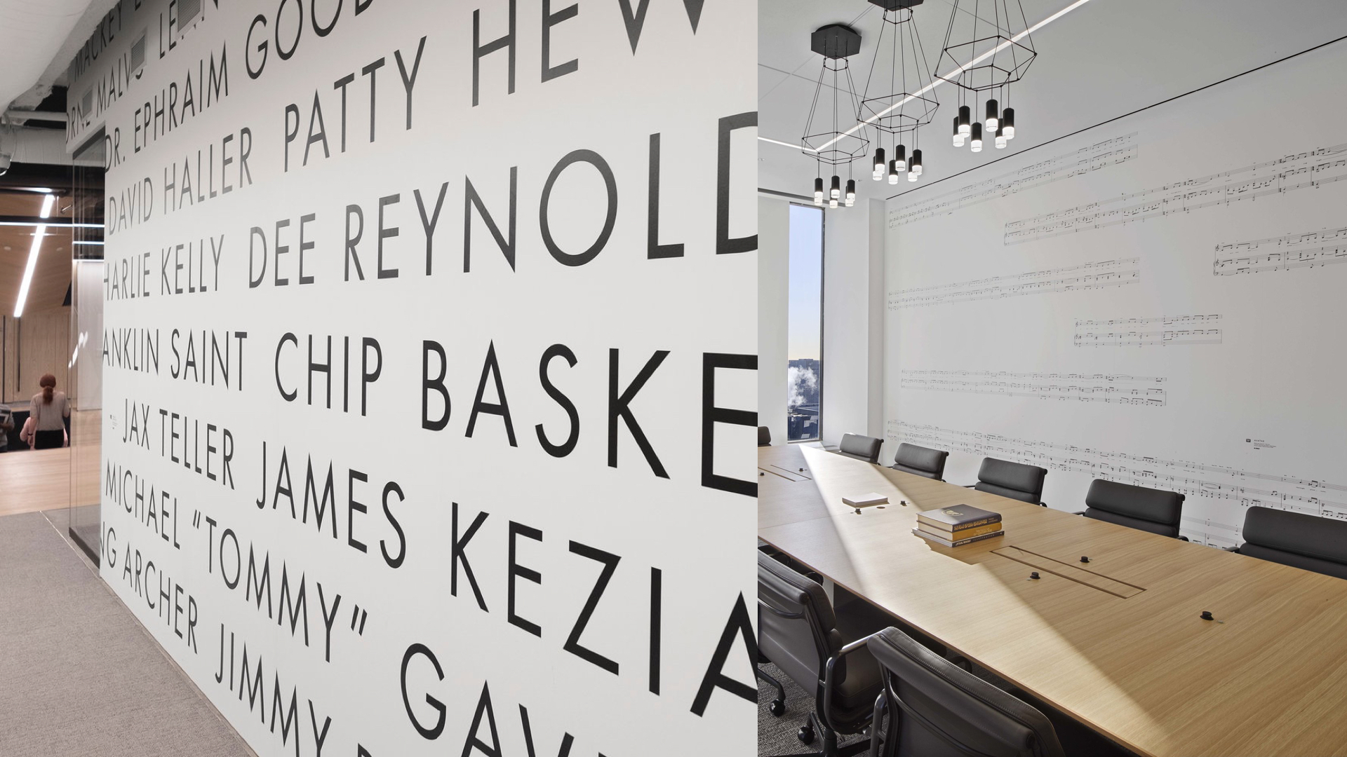
21ST CENTURY FOX
Worked with Gretel to extend 21st Century Fox’s new brand expressions into physical space for their remodeled New York-based office. Content was curated from the rich history of 21CF’s many core brands, which span television, film, sports, and news. 43 unique wall murals were created in total. Full case study available here.
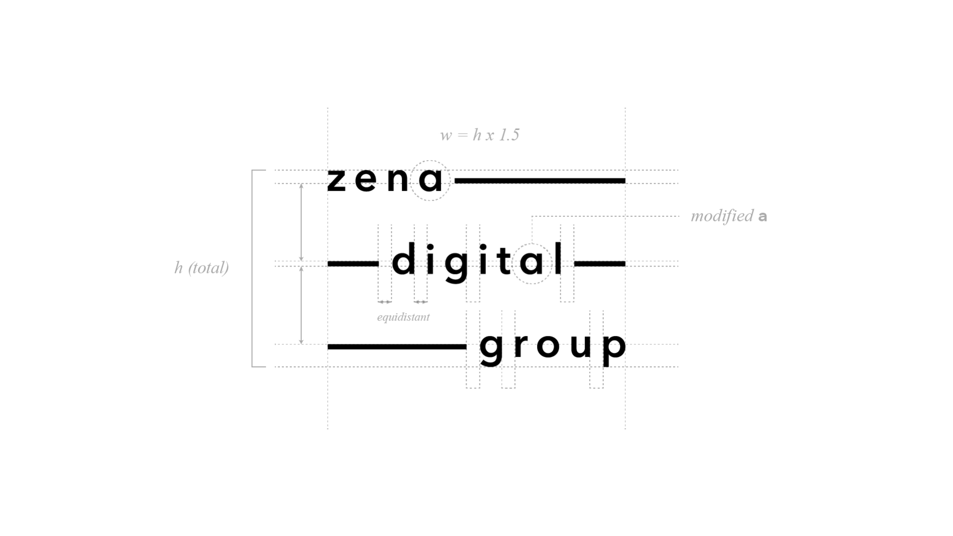
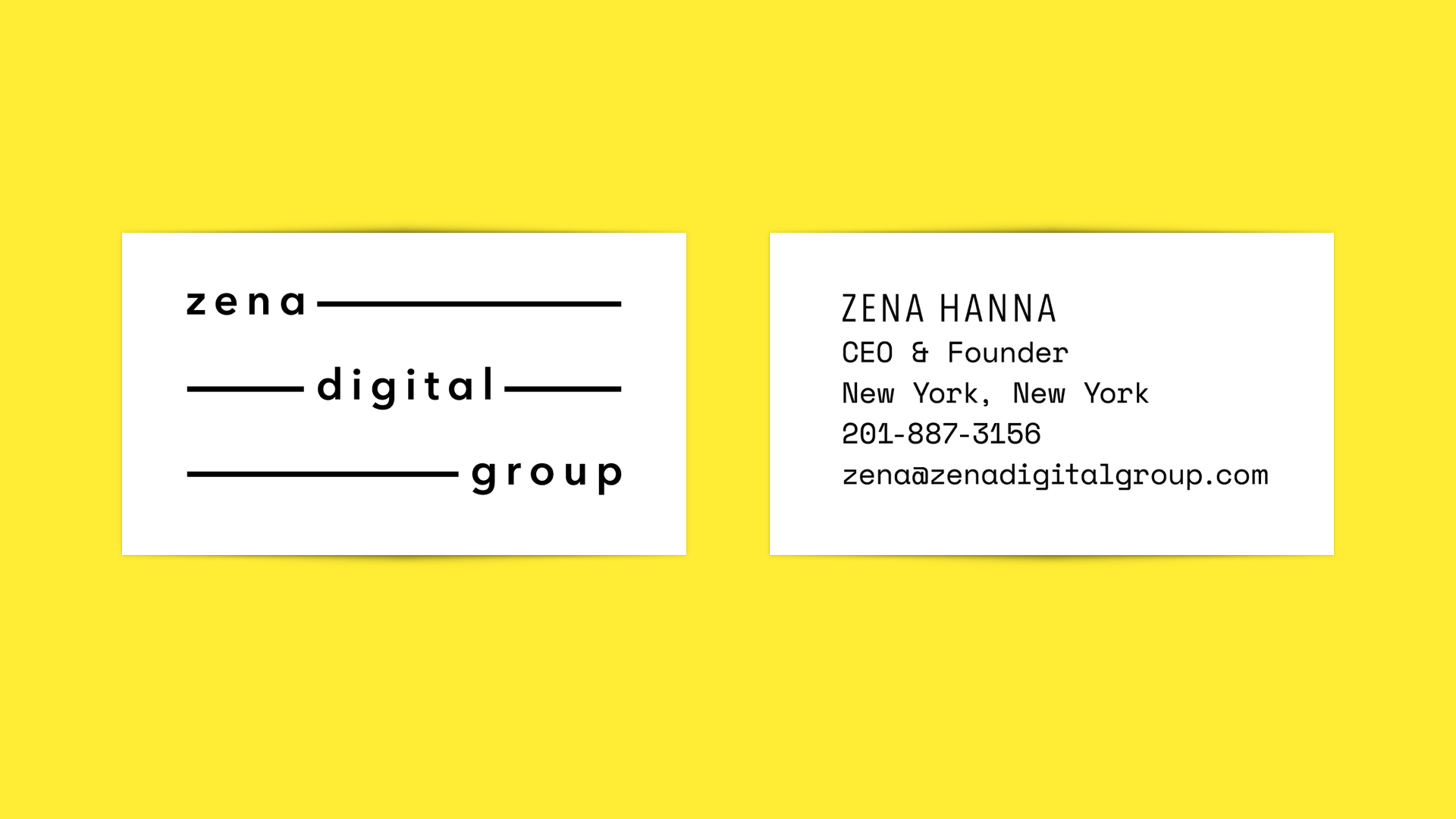
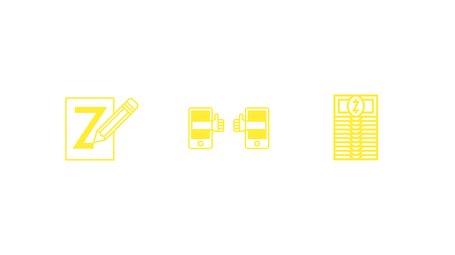
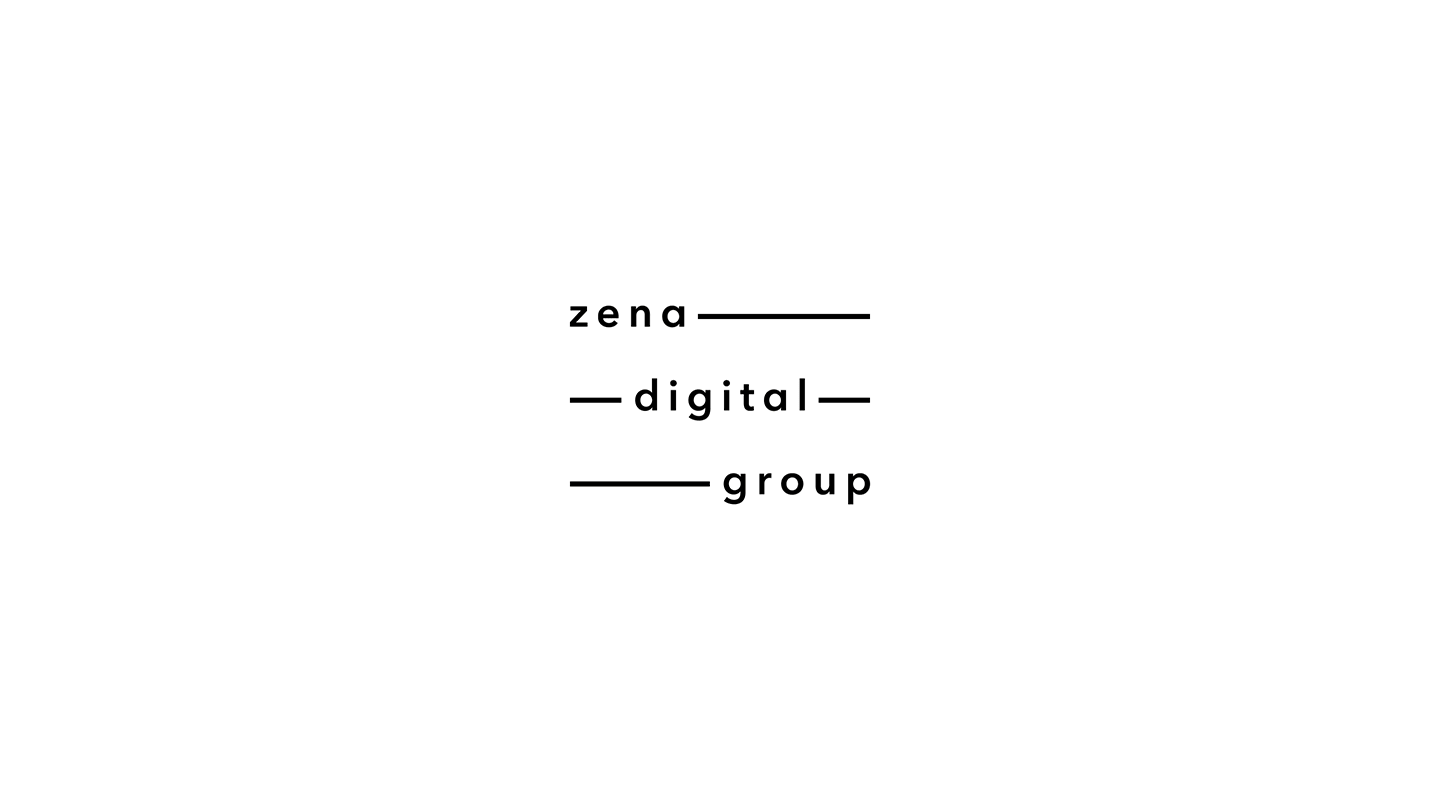
ZENA DIGITAL GROUP
Complete brand identity for a boutique media agency based in New York City.
Design included logo, website, and numerous animated illustrations. Click here to view full website.
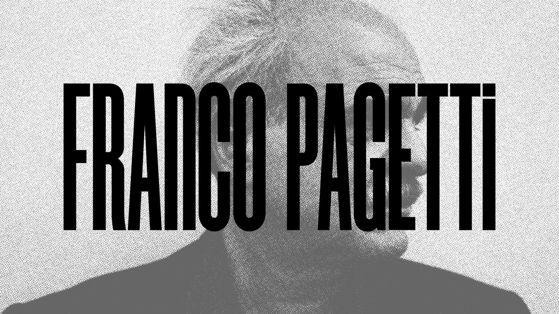
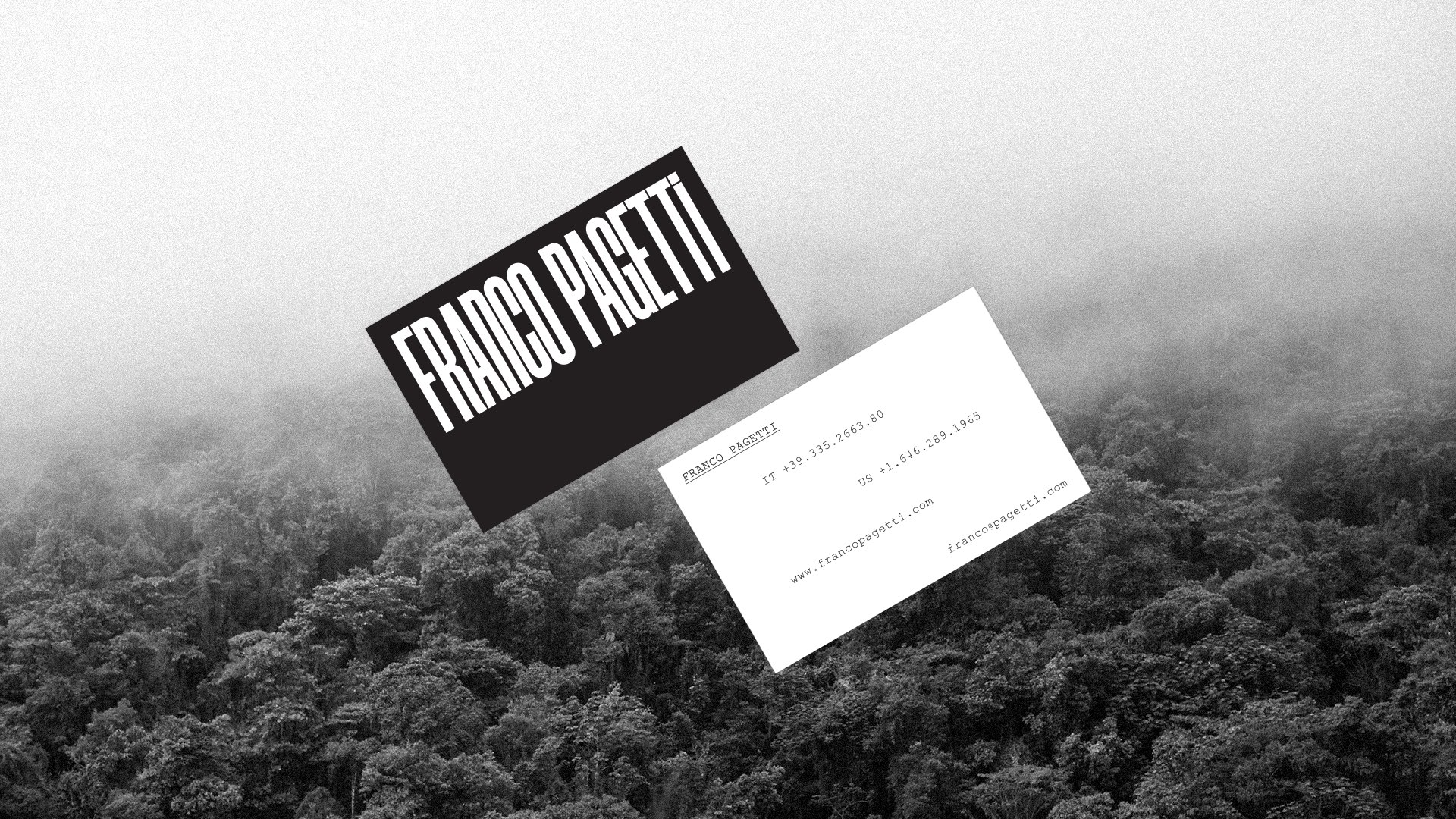
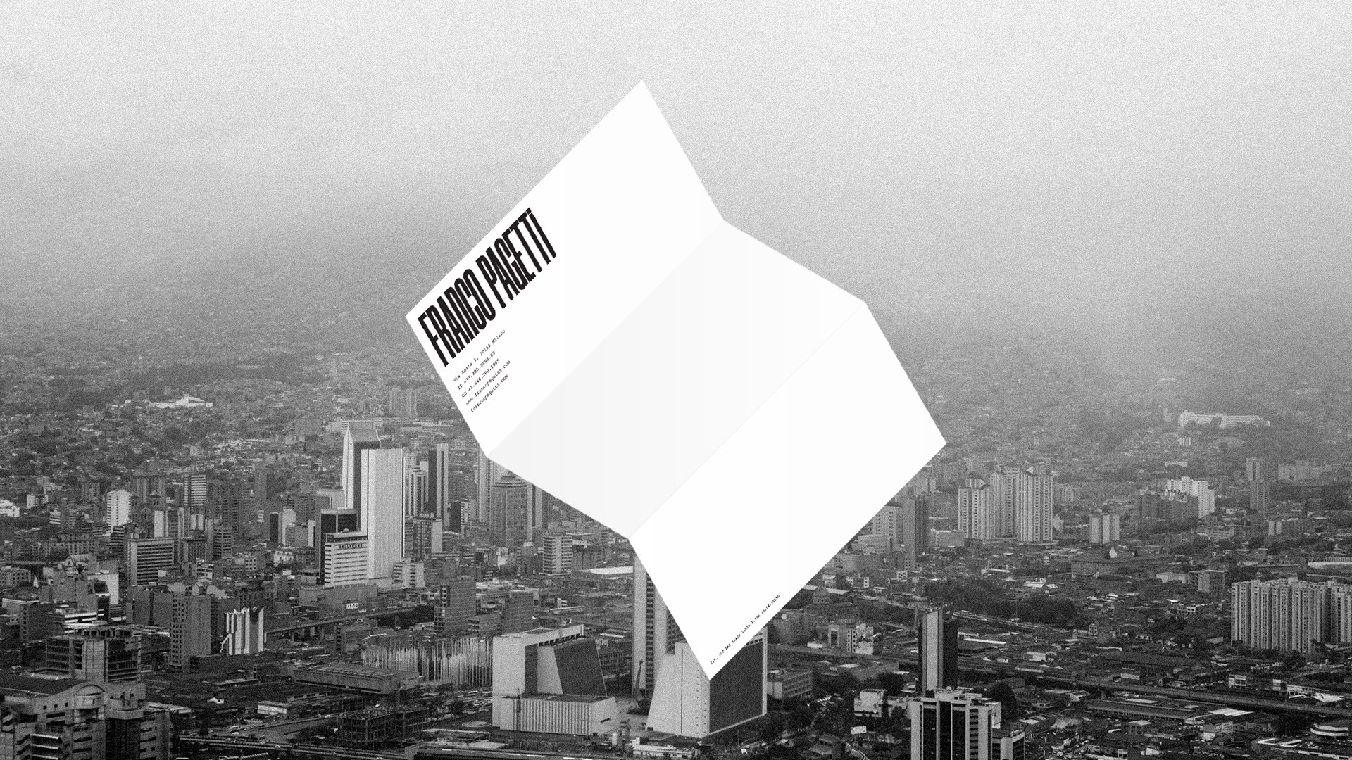
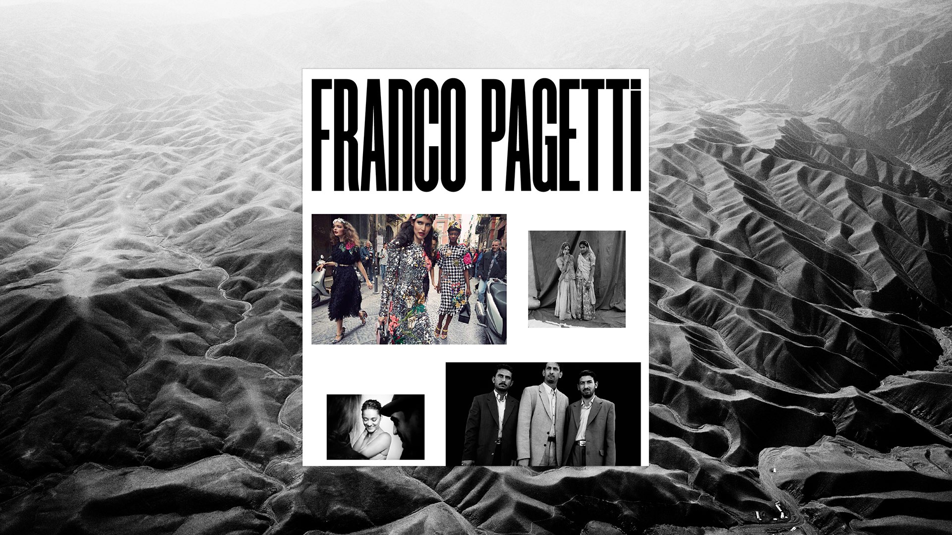
FRANCO PAGETTI
Custom logotype, branded collateral, and website design for Italian photographer Franco Pagetti, whose work ranges from conflict journalism to high fashion. Click here to view full website.


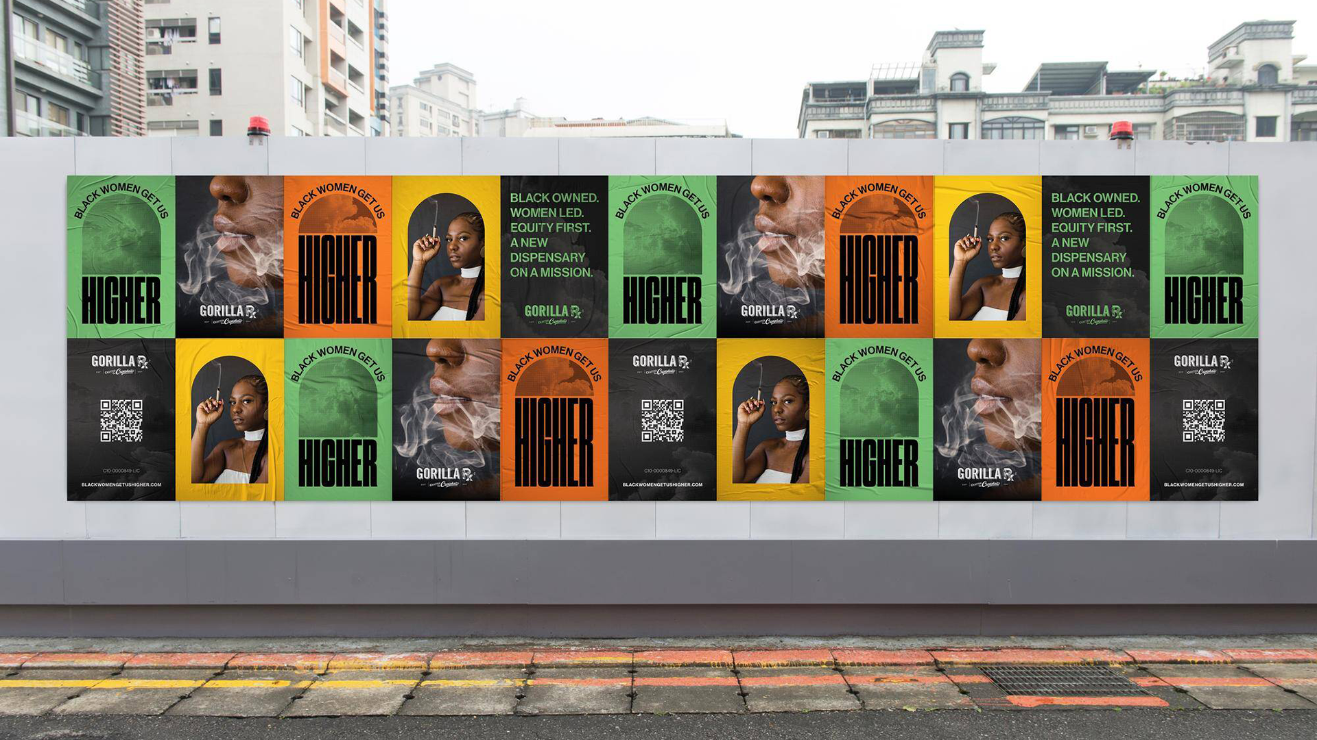


GORILLA Rx
Campaign that seeks to elevate a Black Woman-owned cannabis dispensary in Los Angeles. Learn more here.


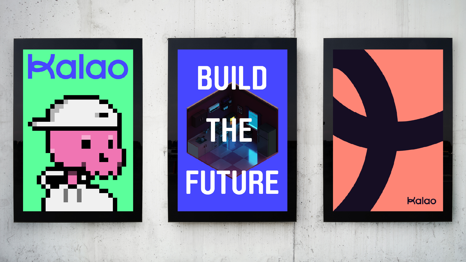

KALAO
Playful brand design for a proposed NFT ecosystem.
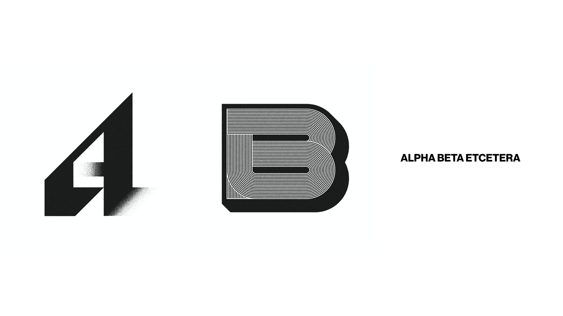
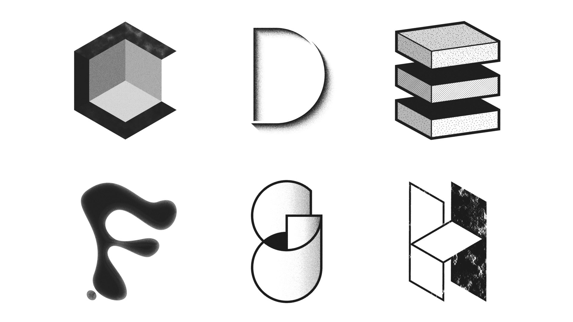
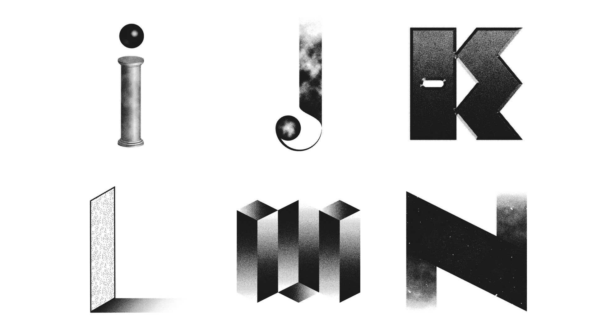
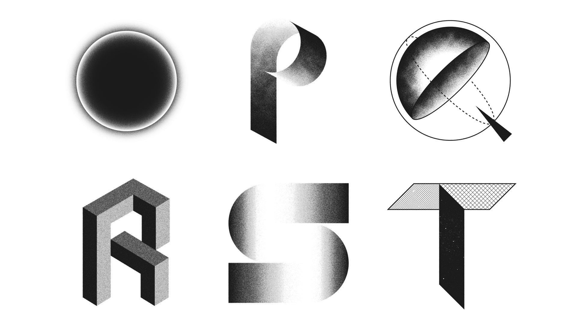
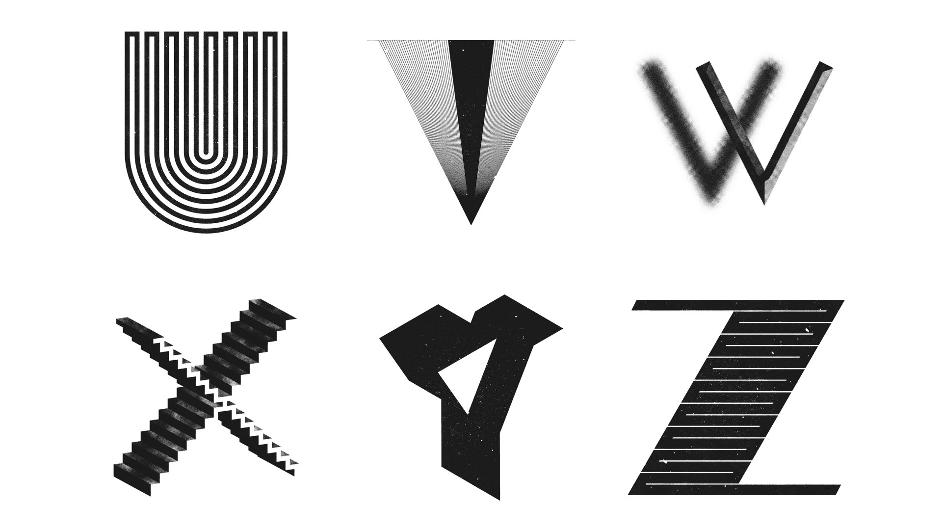
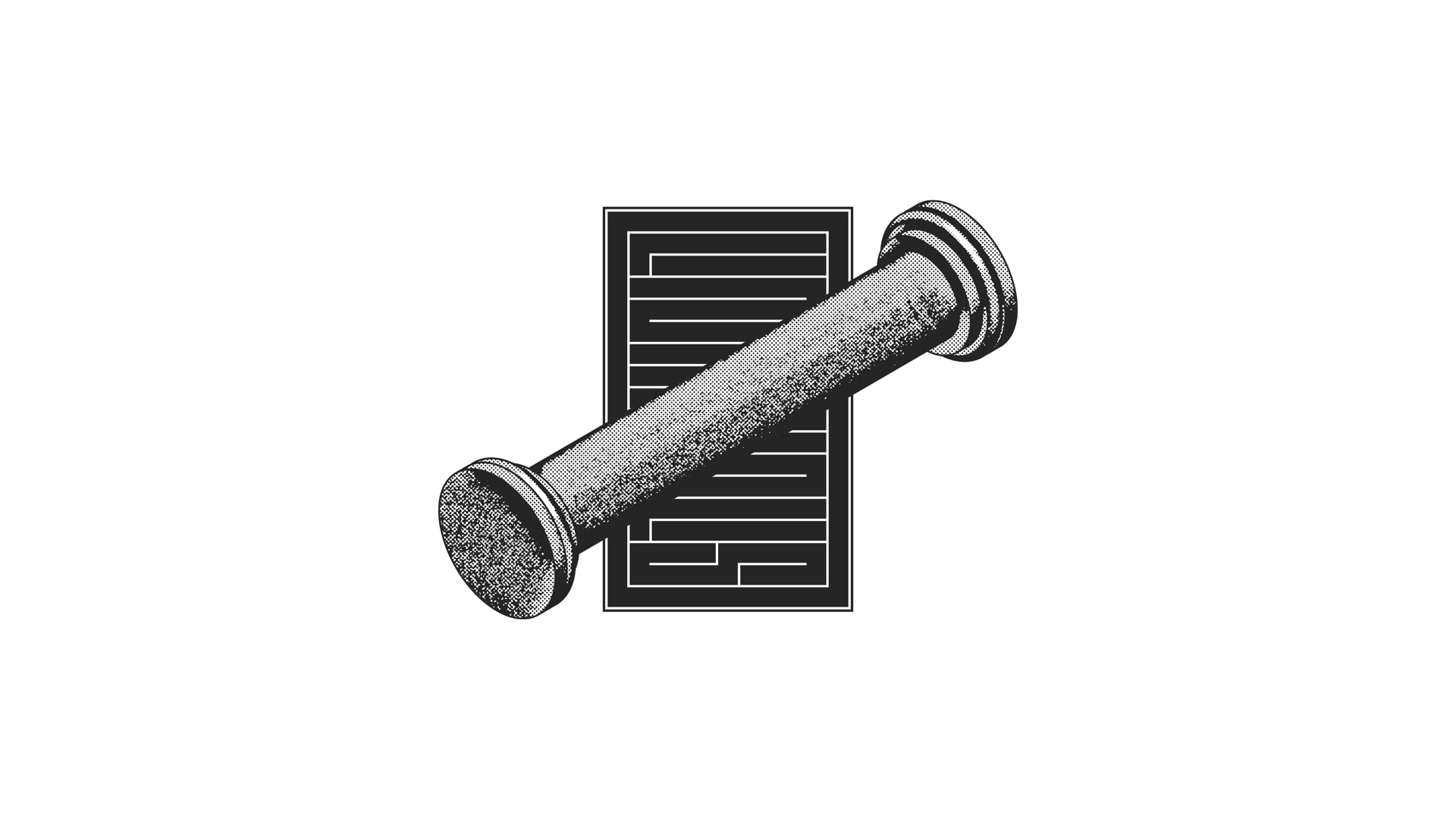
ALPHA BETA ETCETERA
A self-initiated project whereby a letter was created every day for 26 days. I chose to limit myself to black and white and approached the typography dimensionally, as one would sculpture or architecture.
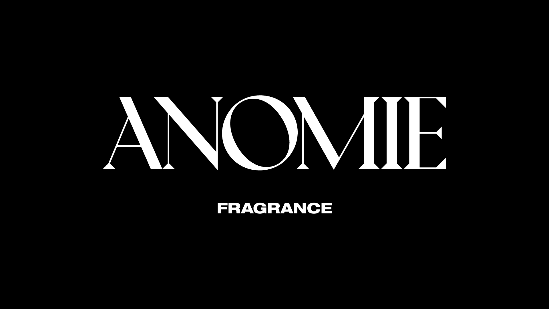
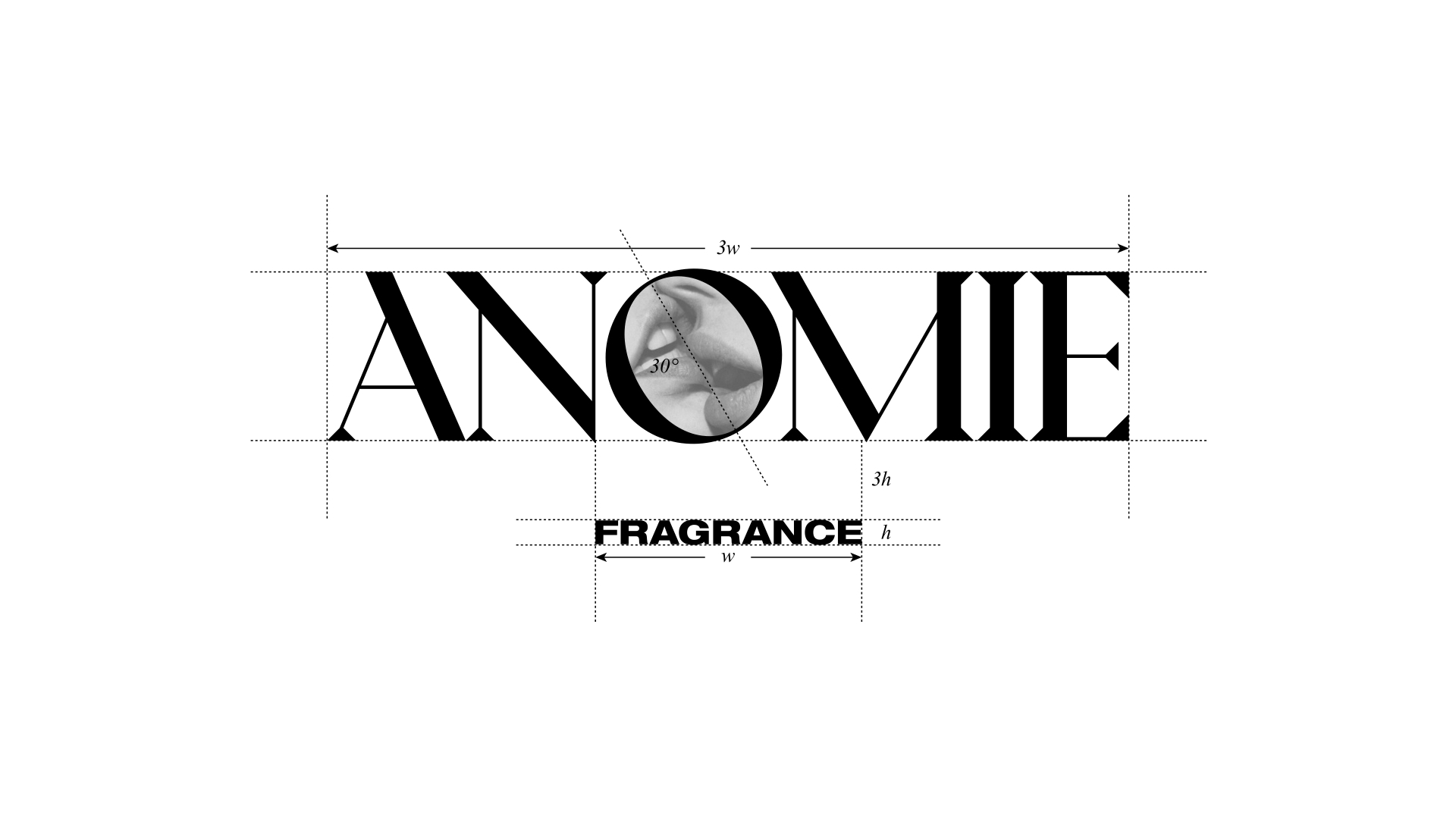
ANOMIE FRAGRANCE
Custom logotype for an intentionally fringe fragrance brand inspired by queer creative subculture. Officially launching soon.
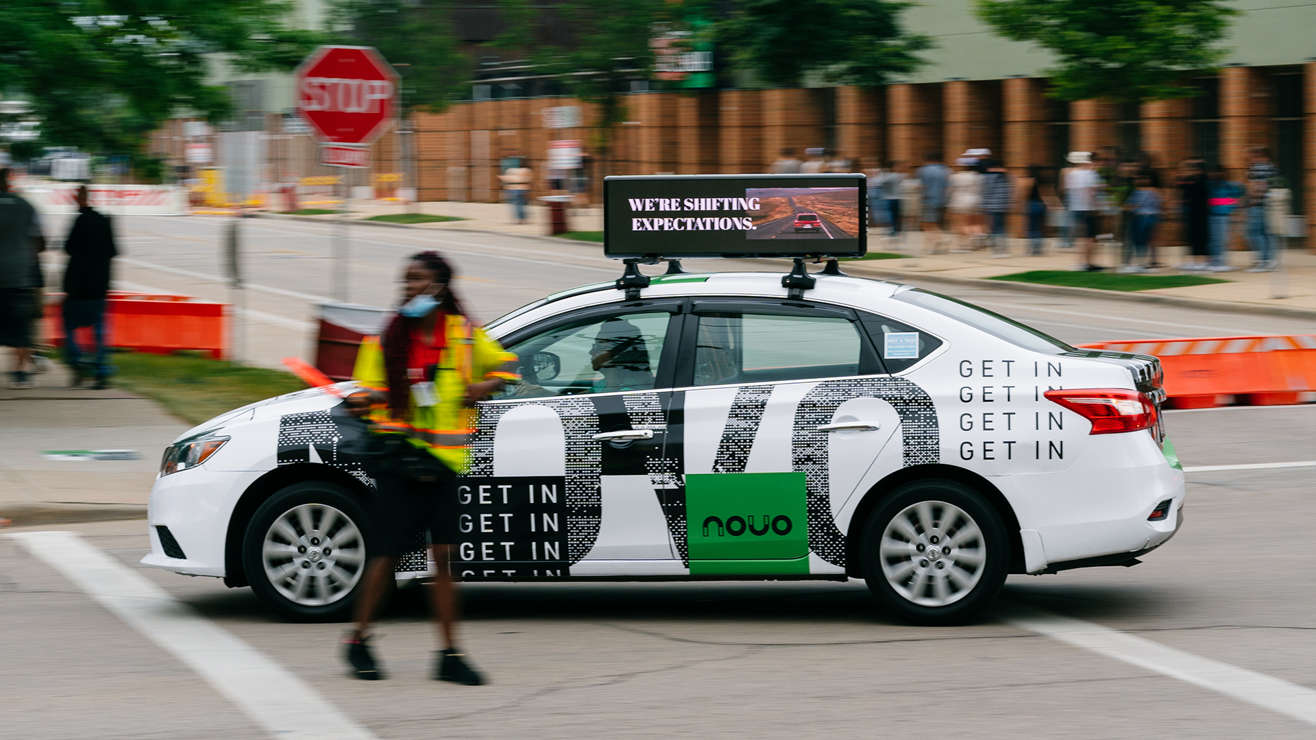

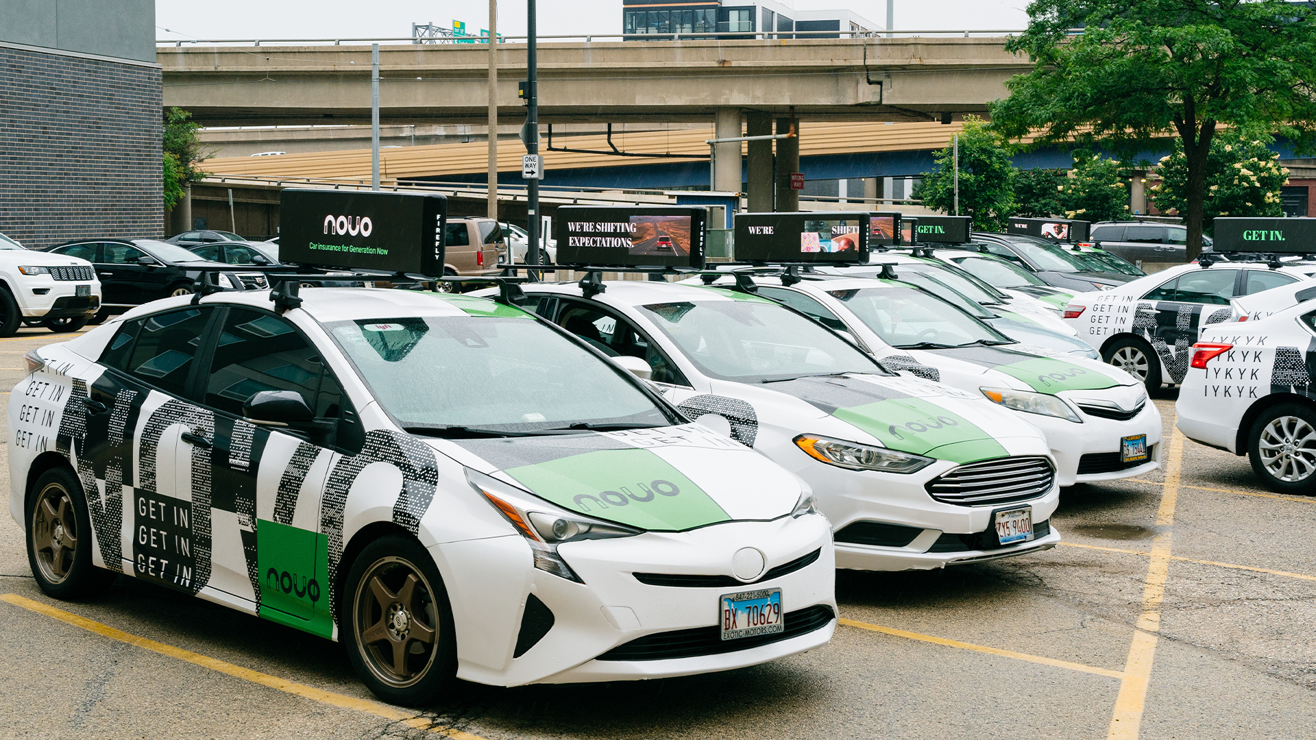
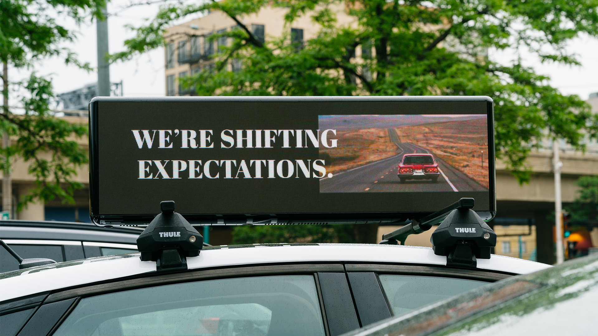
NOVO
Bold graphics for a disruptive car insurance activation in Milwaukee, WI.

LIMINALIS
Logotype and assorted concepts for an ambient techno music project. Inspired by Eastern scripts such as Kufic Arabic and Tibetan Phags-pa.
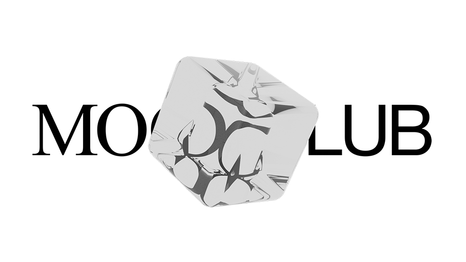
MOODCLUB
Logo and 3D animation for a forthcoming project. Additional details available upon request.
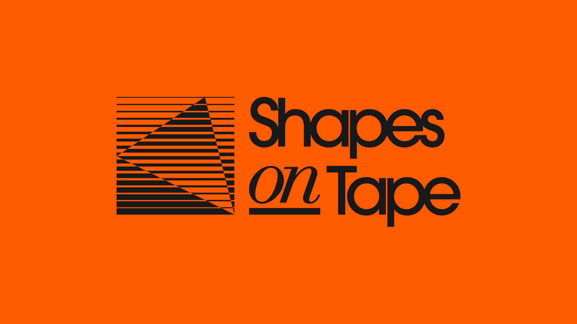
SHAPES ON TAPE
Retro lockup for a Brooklyn-based synthpop duo. Cues were taken from blank VHS and cassette tape covers as well as 80s albums such as this.
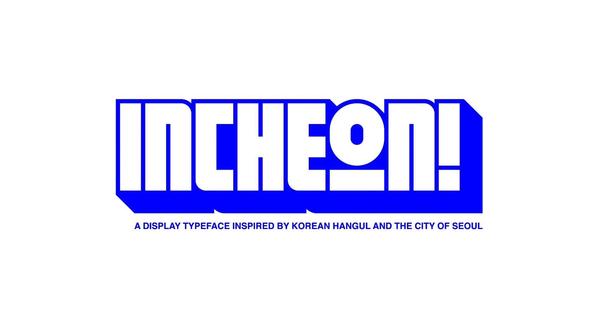
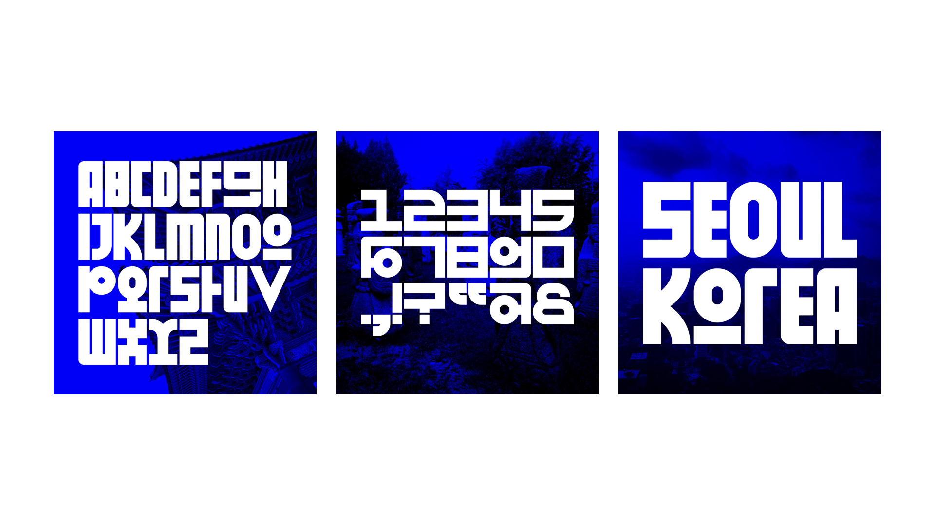
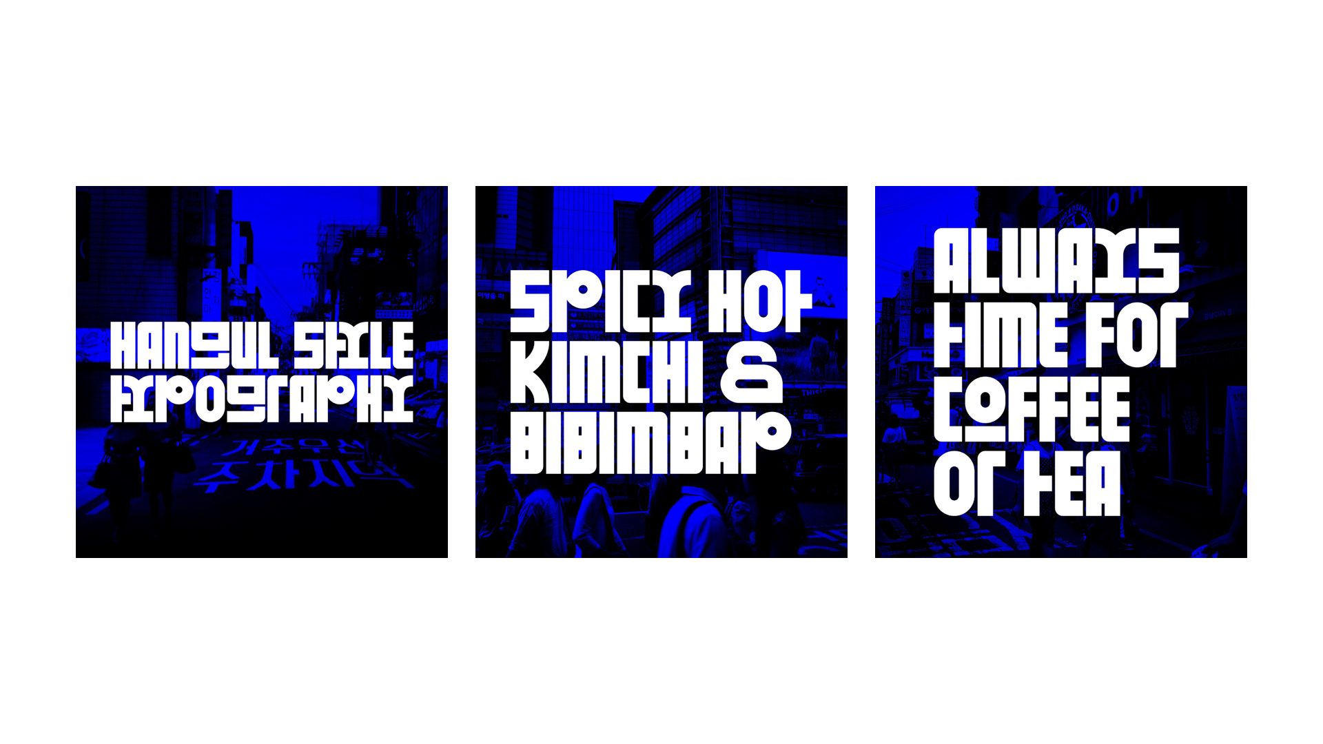
INCHEON!
INCHEON! is an experimental display typeface inspired by a trip to Seoul and the curvilinear geometry of hangul, the Korean written language. The typeface was named after the Incheon International Airport by which I arrived; where east meets west. The aim was to create a condensed sans serif that seemingly compartmentalizes into digraphs, much like how Korean letters (jamo) fit into one another to form a single, phonetic sound. It was important to maintain the modern spirit of hangul, an alphabet that was historically designed, and the bold signage that bombarded me as I walked down the streets of Seoul.
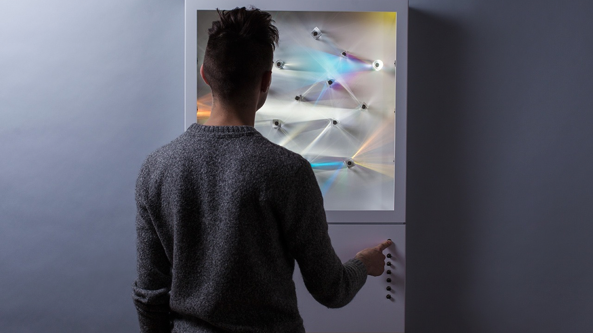
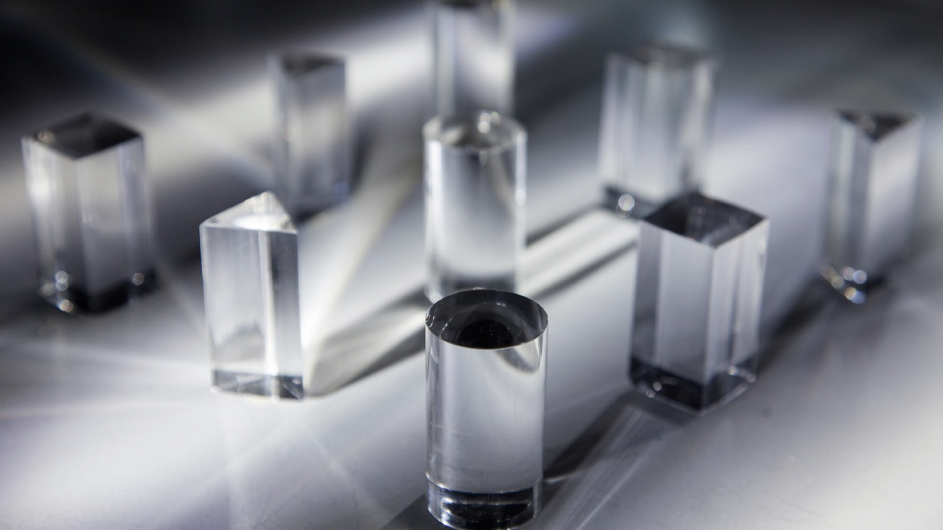
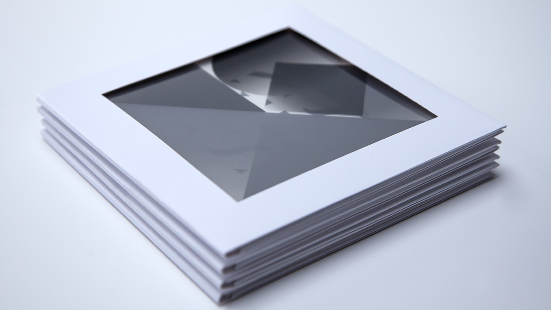
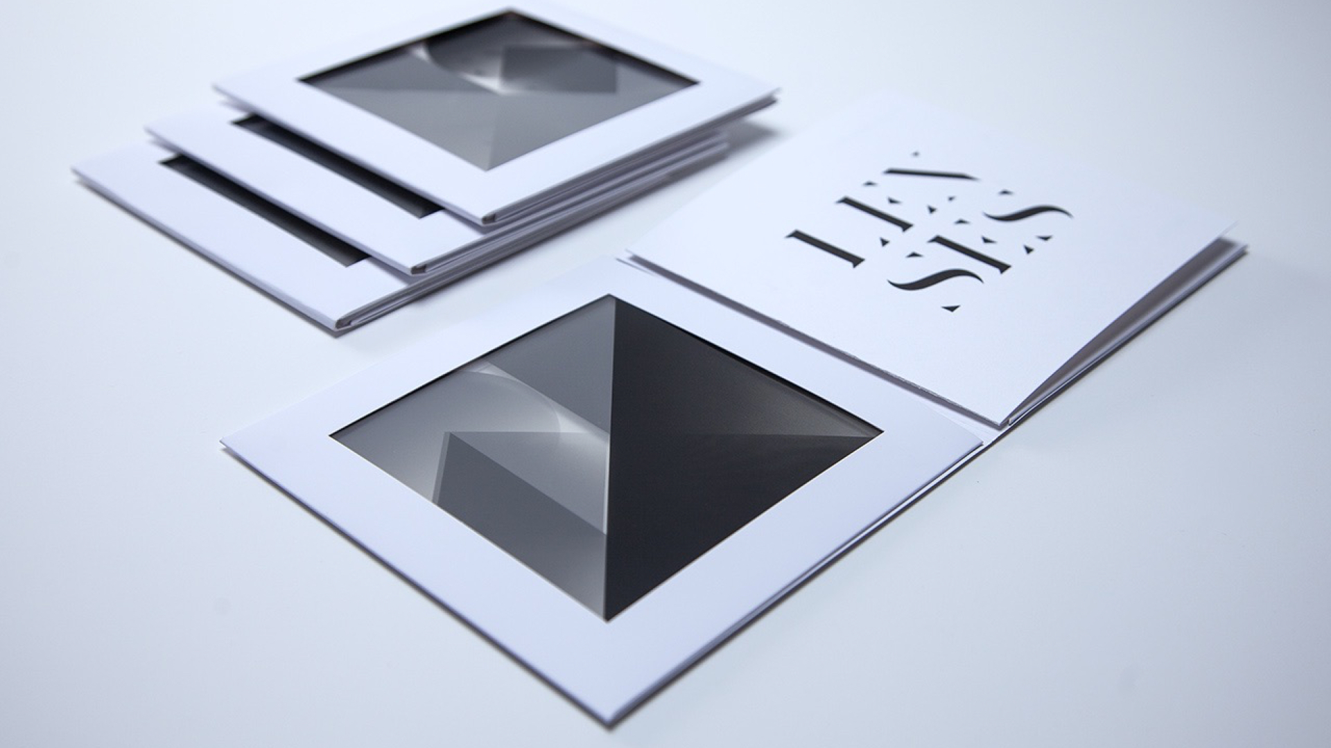
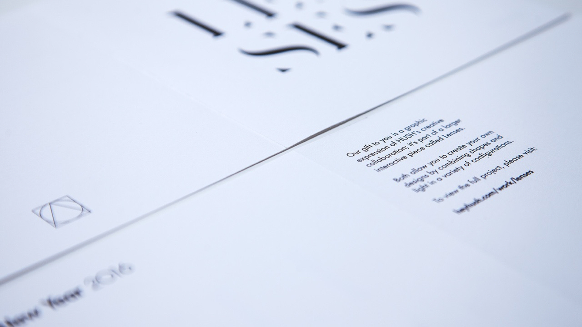
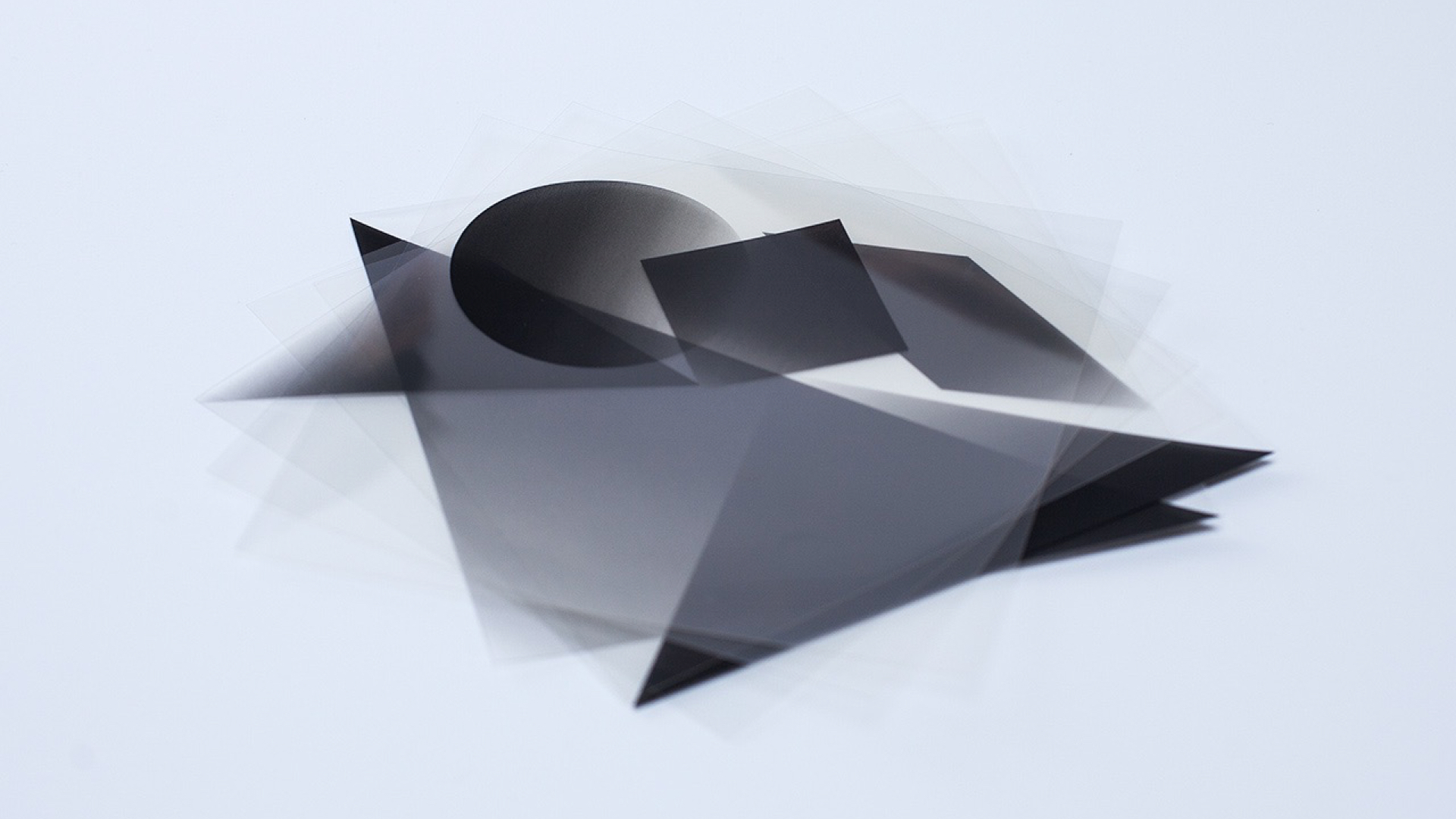
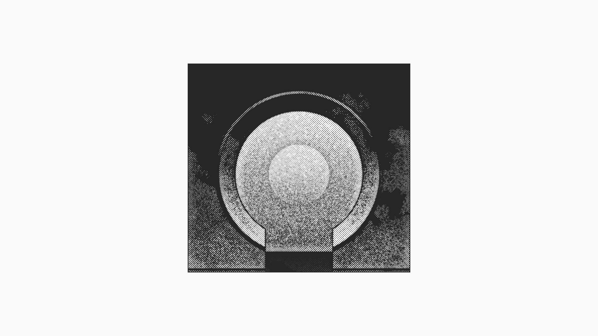
LENSES
Lenses is an interactive audiovisual installation that uses prisms, light and sound to represent the interplay of ideas between HUSH's designers, architects, musicians, and technologists. By arranging the prisms across a surface designed to bend and reflect light, users build a glowing, colorful visual array. This is then read by custom software and translated into sounds in real-time, resulting in a warm, ambient soundscape to accompany the powerful visual composition.
An accompanying gift card was designed to inspire friends and partners at the start of 2016. I designed a miniature, interactive experience akin to Lenses that allows recipients to create their own compositions via layers of printed transparencies.
An accompanying gift card was designed to inspire friends and partners at the start of 2016. I designed a miniature, interactive experience akin to Lenses that allows recipients to create their own compositions via layers of printed transparencies.
KK © 2025